
When iPhones took off, every company needed an app in the App Store.
Now, as AI chat apps gain traction (and MCP becomes the standard) every company will need an MCP that lets others plug into their AI.
Starting today, every Quickchat AI user can launch their own MCP with a single click.
Most people describe MCPs as the USB-C of AI — the universal connector for AI apps, a simple, standardized way to add any tool to platforms like Claude or ChatGPT.
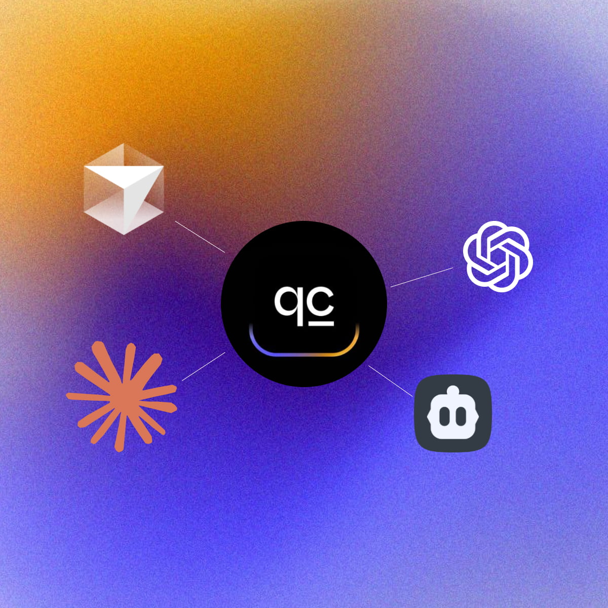
But here’s how we see it: MCP lets your favorite AI app message another AI on your behalf and let you know what it said. With Quickchat AI MCP, anyone can plug your AI Agent into Claude, (soon) ChatGPT, Cursor, or any other AI app that supports the protocol.
If you need a refresher on what MCP is, check out our detailed, step-by-step guide.
You can also watch the entire tutorial here:
What is Quickchat AI MCP server?
The Quickchat AI MCP (Model Context Protocol) server allows you to let anyone plug in your Quickchat AI Agent into their favourite AI app such as Claude Desktop, Cursor, VS Code, Windsurf and more.
Quickstart
- Create a Quickchat AI account and start a 7-day trial of any plan.
- Set up your AI’s Knowledge Base, capabilities, and settings.
- Go to the MCP page to activate your MCP. Give it Name, Description and (optional) Command. They are important — AI apps need to understand when to contact your AI, what its capabilities and knowledge are.
- That’s it! Now you’re ready to test your Quickchat AI via any AI app and show it to the world!
 Claude tool anatomy
 Cursor tool anatomy
Prerequisite
Install uv using:
curl -LsSf https://astral.sh/uv/install.sh | sh
or read more here.
Test with Claude Desktop
Configuration
Go to Settings > Developer > Edit Config. Open the claude_desktop_config.json file in a text editor.
If you’re just starting out, the file is going to look like this:
{
  "mcpServers": {}
}
This is where you can define all the MCPs your Claude Desktop has access to.
Here is how you add your Quickchat AI MCP:
{
  "mcpServers": {
    "< QUICKCHAT AI MCP NAME >": {
      "command": "uvx",
      "args": ["quickchat-ai-mcp"],
      "env": {
        "SCENARIO_ID": "< QUICKCHAT AI SCENARIO ID >",
        "API_KEY": "< QUICKCHAT AI API KEY >"
      }
    }
  }
}
Go to the Quickchat AI app > MCP > Integration to find the above snippet with the values of MCP Name, SCENARIO_ID and API_KEY filled out.
Test with Cursor
Configuration
Go to Settings > Cursor Settings > MCP > Add new global MCP server and include the Quickchat AI MCP snippet:
{
  "mcpServers": {
    "< QUICKCHAT AI MCP NAME >": {
      "command": "uvx",
      "args": ["quickchat-ai-mcp"],
      "env": {
        "SCENARIO_ID": "< QUICKCHAT AI SCENARIO ID >",
        "API_KEY": "< QUICKCHAT AI API KEY >"
      }
    }
  }
}
As before, you can find values for MCP Name, SCENARIO_ID and API_KEY at Quickchat AI app > MCP > Integration.
Test with other AI apps
Other AI apps will most likely require the same configuration but the actual steps to include it in the App itself will be different. We will be expanding this blog post as we go along.
Launch your Quickchat AI MCP to the world!
⛔️ Do not publish your Quickchat API key to your users!
Once you’re ready to let other users connect your Quickchat AI MCP to their AI apps, share configuration snippet with them!
However, you need to make sure they can use your Quickchat AI MCP without your Quickchat API key.
Here is how to do that:
-
On the Quickchat App MCP page, turn the Require API key toggle OFF.
-
Share the configuration snippet without the API key:
{
"mcpServers": {
    "< QUICKCHAT AI MCP NAME >": {
    "command": "uvx",
    "args": ["quickchat-ai-mcp"],
    "env": {
        "SCENARIO_ID": "< QUICKCHAT AI SCENARIO ID >"
    }
    }
}
}
Cool features
- You can control all aspects of your MCP from the Quickchat AI dashboard. With one click, your changes are deployed. That includes the MCP name and description — all your users need to do is refresh their MCP connection.
- View all conversations in the Quickchat Inbox. Remember: those won’t be the exact messages your users send to their AI app but rather the transcript of the AI <> AI interaction between their AI app and your Quickchat AI.
- Unlike most MCP implementations, this isn’t just a static tool handed to an AI.
- It’s an open-ended way to send messages to Quickchat AI Agents you create.
Running from source
Debugging with the MCP inspector
uv run mcp dev src/__main__.pyDebugging with Claude Desktop, Cursor or other AI apps
Use the following JSON configuration:
{
  "mcpServers": {
    "< QUICKCHAT AI MCP NAME >": {
      "command": "uv",
      "args": [
        "run",
        "--with",
        "mcp[cli]",
        "--with",
        "requests",
        "mcp",
        "run",
        "< YOUR PATH>/quickchat-ai-mcp/src/__main__.py"
      ],
      "env": {
        "SCENARIO_ID": "< QUICKCHAT AI SCENARIO ID >",
        "API_KEY": "< QUICKCHAT AI API KEY >"
      }
    }
  }
}
Testing
Make sure your code is properly formatted and all tests are passing:
ruff check --fix
ruff format
uv run pytest
Ready to go?
With just a few steps, you can make your Quickchat AI Agent accessible from anywhere. Whether you’re building internal tools or sharing your AI with the world, our MCP integration makes it easy.
You also get:
- ✅ A shared Inbox to view conversations
- 🔄 Conversation analytics via the Dashboard
Useful Links
Ready to go?
Go to the Quickchat AI app and let the world connect to your AI.
And if you build something cool with your MCP, we’d love to see it! Share it with us on Twitter or LinkedIn.